 |
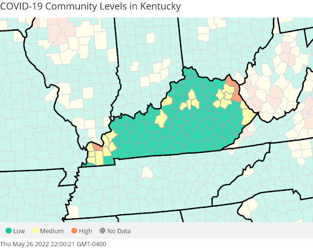
| Centers for Disease Control and Prevention has 25 Kentucky counties with elevated Covid-19 risk. |
Four Kentucky counties are red on the latest Centers for Disease Control and Prevention's national Covid-19 risk map, indicating a high level of coronavirus transmission. Twenty-one Kentucky counties are yellow, indicating a medium level of transmission.
The red counties are McCracken in Western Kentucky and Greenup, Boyd and Lawrence in the northeast. McCracken was the only red county on last week's map; officials there questioned the status.
Gov. Andy Beshear referred to last week's map at a news conference a few hours before release of the new one. "We should be a little bit concerned" with having counties in red on the CDC's risk map, he said, because it is based on hospital admissions and capacity as well as new coronavirus cases.
In red counties, state guidelines call for wearing masks in indoor public spaces, limiting in-person gatherings, limiting the size of gatherings, and social distancing. Beshear said of the mask recommendation, "It is a wise decision to make."
The 21 yellow counties are Ballard, Carlisle, Hickman, Graves, Livingston, Marshall, Crittenden, Lyon, Hardin, Jefferson, Anderson, Woodford, Fayette, Scott, Menifee, Morgan, Rowan, Elliott, Carter, Martin, and Pike. Last week there were 33 yellow counties in Kentucky.
The cluster of yellow and red counties in Eastern Kentucky border a large cluster of red and yellow counties in West Virginia. Some Southern Illinois counties are near the West Kentucky cluster.
 |
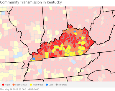
| CDC case-incidence map shows high virus transmission in many counties. |
The latest CDC community transmission map, based on new cases, shows a high transmission level in many Kentucky counties and those in border states.
Last week, state Public Health Commissioner Steven Stack encouraged Kentuckians to use the CDC risk map to determine the level of coronavirus risk in their communities, saying that the transmission or incidence-rate map, which reflects new cases per 100,000 people in each county, is largely used by researchers, the news media and others who are tracking the disease. "This is not the decision-making map anymore," he said.
Asked about this difference of opinion, Susan Dunlap, spokeswoman for the Cabinet for Health and Family Services, expounded on several points Stack made at that same press conference to support using the CDC map for community transmission guidance. She wrote:
- Both the reported incidence of Covid-19 and percent positivity have continued to increase at a slow and steady rate from very low levels in mid-April. However, although we are seeing more spread of Covid-19 in the community, this is not yet corresponding to large increases in severe disease.
- Hospitalization trends remain both low and stable. We continue to regularly monitor hospital census data for Covid-19 patients, ICU admissions, and ventilator usage. We also monitor syndromic surveillance reports from hospital encounters and emergency department visits. All consistently show that the hospital burden of Covid-19 remains well below levels of concern.
- Although many counties are now at “moderate” (yellow), “substantial” (orange), and even “high” (red) levels on the incidence rate map, most of these jurisdictions remain “low” (green) on the [CDC's] Covid-19 Community Levels map. The Covid-19 Community Levels [map] combine incidence with hospital admissions data to estimate the overall burden of Covid-19 in the community. These specific metrics were selected for this tool because they most accurately predicted future hospital burden of Covid-19.
"We should be watching it," Beshear said. "We don't believe that currently what we're seeing is cause for concern, but we should certainly be paying attention."
Beshear said fewer people are being hospitalized with the virus because so many Kentuckians have been vaccinated, boosted or acquired natural immunity from being infected.
 |
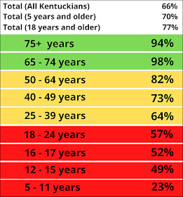
| State table, adapted by Kentucky Health News |
No comments:
Post a Comment